Vocab-tastic
A vocabulary learning app that uses flashcards and gamification
A vocabulary learning app that uses flashcards and gamification
Overview
Vocab-tastic is a vocabulary mobile application that uses flashcards and gamified learning to help users improve their English vocabulary.
Purpose: An introductory project for my UX Fundamental course in CareerFoundry
Duration: 2 months (Part-time)
Role: UX Designer
Methods: Design Thinking
Tools: Pen and paper, Marvel app
What app features will help users to be motivated and engaged in learning new vocabulary?
Problem Statement
It's quite challenging when we want to learn new words and try to recall them. Building our vocabulary is a continuous learning process and should be practiced often to be able to remember them when there's an opportunity to use them. Our users need a tool that is easy to use, fun, and will keep them engaged.
Solution
Build a mobile application that will help users improve their English vocabulary through the use of flashcards and gamification.
Research
COMPETITIVE ANALYSIS
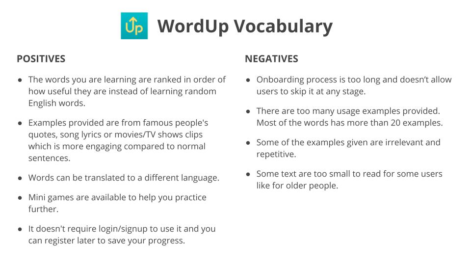
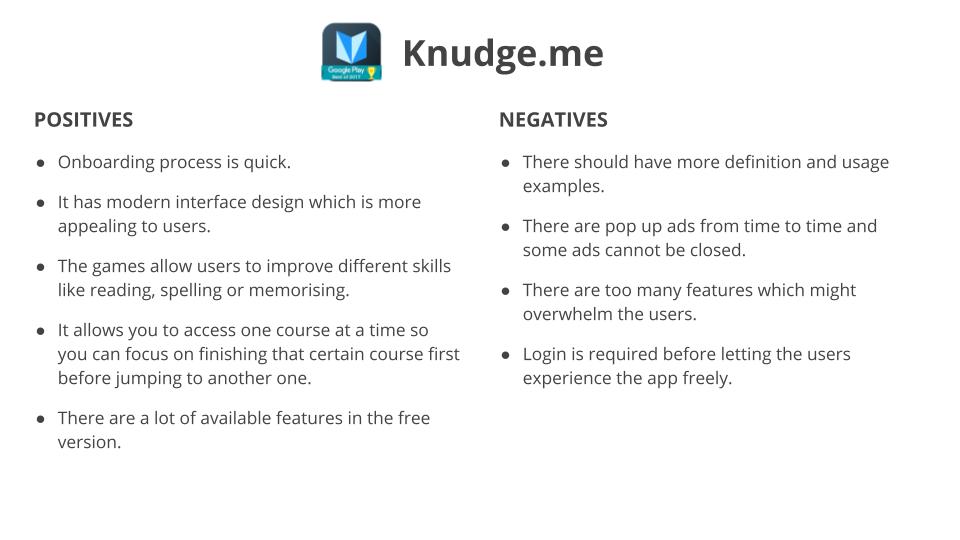
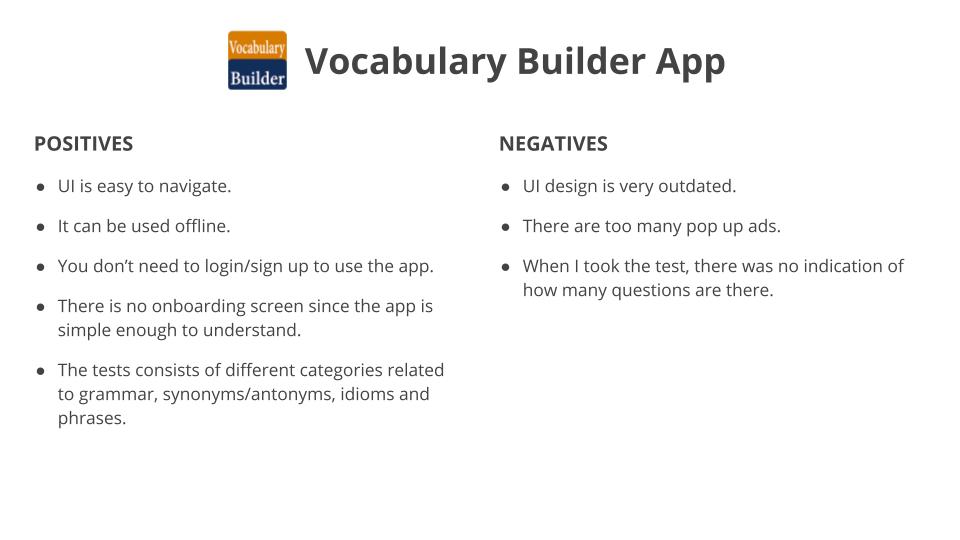
The first step of the process is identifying and evaluating my competitors in the market. So I compared 3 apps ( Word Up, Knudge.me & Vocabulary Builder app) to identify the positives and negatives of each app that can help build the features of Vocab-tastic.
USER INTERVIEW
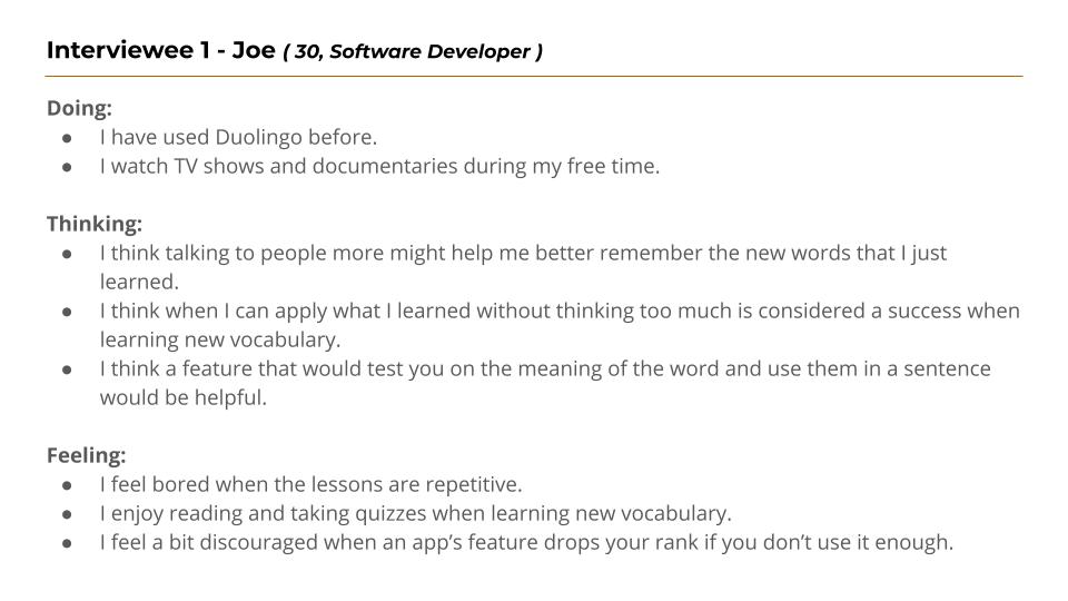
To get a better understanding of my target audience, I conducted 3 interviews with participants who had used vocabulary learning applications in the past.
The result of the interviews was sorted into 3 categories: Doing, Thinking, Feeling.
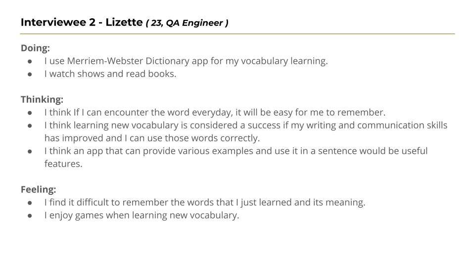
Click here to view the detailed user interview results.
Main Takeaways:
- When learning new vocabulary, they struggle to remember the words they just learned and their meaning.
- All of them like playing games and taking quizzes when learning new words.
- Encountering the word every day will help them to remember it and its meaning.
- Having various usage examples and an app that can be accessed offline would be useful features for them.
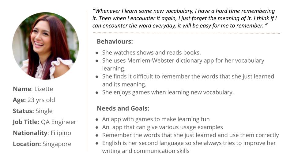
USER PERSONA
Based on the user interview results, I created a proto-persona to represent my target audience and the assumptions I have about vocabulary learning apps.
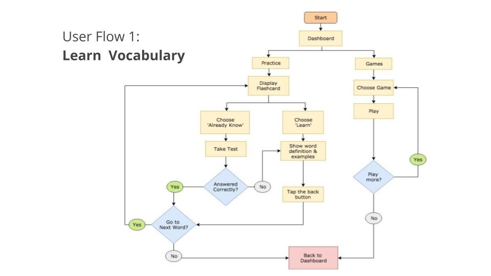
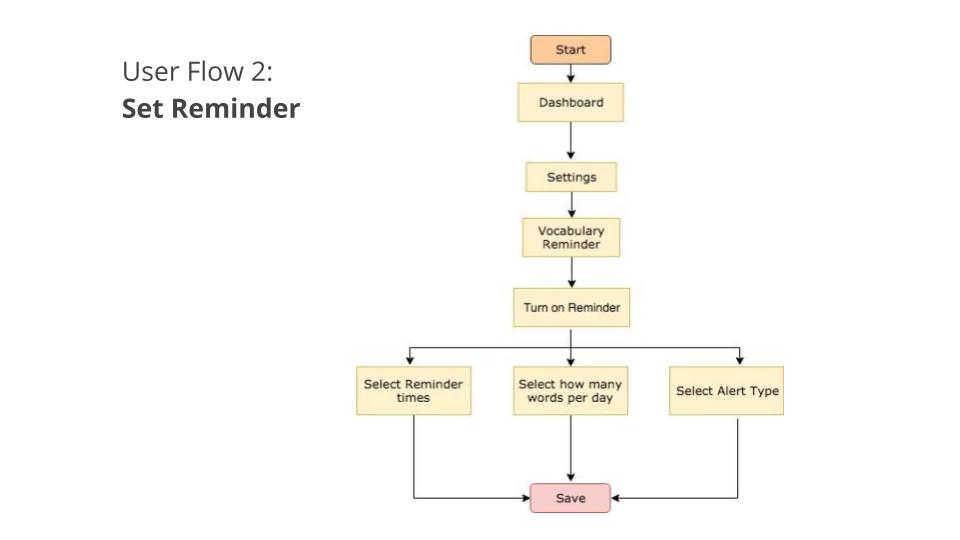
USER FLOWS
Using my user persona as a guide, I then created my user flows to map out the journey of the user when completing a task.
I have defined two main user flows: Learn vocabulary and Set reminder.
Foundational Design
WIREFRAMES & PROTOTYPE
I created my low-fidelity wireframes using pen and paper because of its speed advantage and simplicity.
Below images are some examples of my low fidelity wireframes.
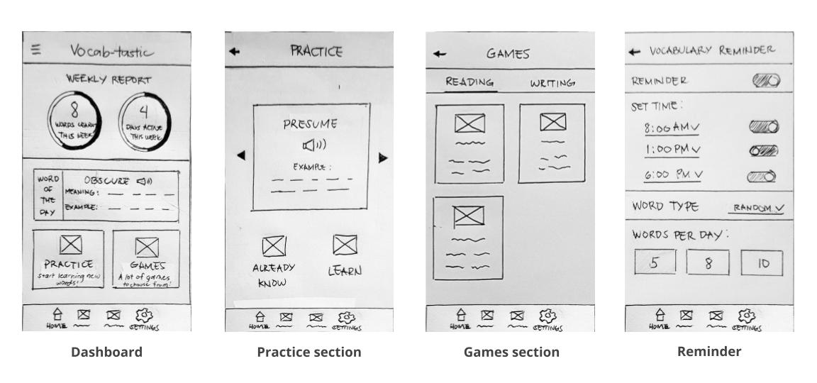
For the dashboard page, I added a weekly report section so that the users can easily see the summary of their progress throughout the week.
As for the games page, since there are only 2 game categories ( reading & writing ), I used a tab-style design for simpler navigation.
I then used the Marvel app to create my low-fidelity prototype.
Click here to view the Low Fidelity Prototype.
Testing
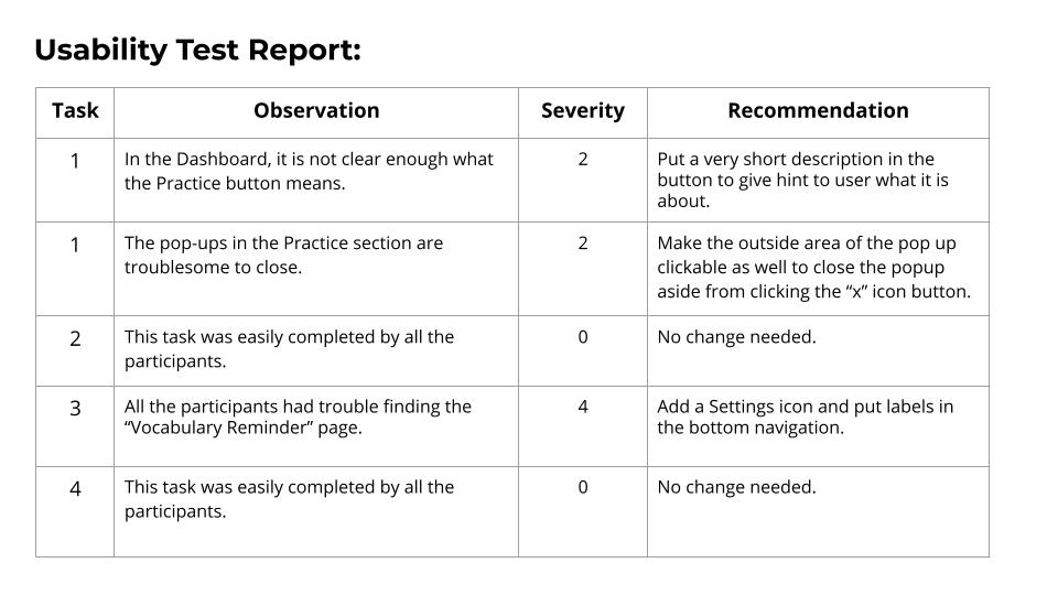
USABILITY TESTING
The next step is to test my low-fidelity prototype with potential users. I prepared a test script and a test plan then conducted my usability testing with 3 participants.
I asked them to complete the following four direct tasks when testing the prototype:
- Learn new words.
- Choose a game that improves your writing skill.
- Turn on the vocabulary reminder and set an alarm time.
- Choose the preferred word type to be reminded about.
All the identified issues were then ranked according to Jakob Nielsen's error severity scale and the result is tabulated in my Usability Test Report.
Jakob Nielsen's rating scale:
- 0 = I don’t agree that this is a usability problem at all
- 1 = Cosmetic problem only: need not be fixed unless extra time is available on the project
- 2 = Minor usability problem: fixing this should be given low priority
- 3 = Major usability problem: important to fix and should be given high priority
- 4 = Usability catastrophe: imperative to fix before the product can be released
Next Steps
This introductory project has given me an overview of the design thinking process. It ended after one round of usability testing but it is far from finished. Thus, my next steps will include converting the sketches into digital wireframes and conducting another round of user testing.
Learnings
- It was my first time doing user interviews and I realised that asking questions is easy but gathering meaningful feedback is not. Some users are not good at explaining why they do this or that so I needed to ask the right follow-up questions. I think I've given some hints to a user at some point. So I need to avoid that next time and should practice more.
- I was excited to do my first wireframes so I keep on trying to make the screens look better and add more details. Thus, I ended up spending more time on my wireframes than I'm supposed to. I think it's still good to be a perfectionist because you strive for the best but you should do it only when necessary.
- When I was doing the usability testing, one user gave negative feedback, so I quickly defended my design. But I realised I should have not done that but instead, I should take that feedback as a way to identify things that can be improved.