SFA Dashboard
Offers insights into sales performance & pipeline status for efficient tracking and management
A vocabulary learning app that uses flashcards and gamification
Overview
I developed a mockup for a Salesforce automation platform to support my previous company’s pitch in securing a key client.
The goal was to create a dashboard that meets the client's operational needs while demonstrating our capability to produce efficient and visually appealing solutions.
Duration: 2 weeks
Role: UI Designer
Tools: Figma
What dashboard features should be included to address the client's operational needs while showcasing the company’s ability to create efficient and visually appealing solutions?
Dashboard features
In this project, I worked closely alongside our CEO, who took the lead in presenting the project pitch to the client. Given the tight timeline, the initial dashboard requirements were outlined by the CEO and then further refined in a workshop session that included myself and a senior designer.
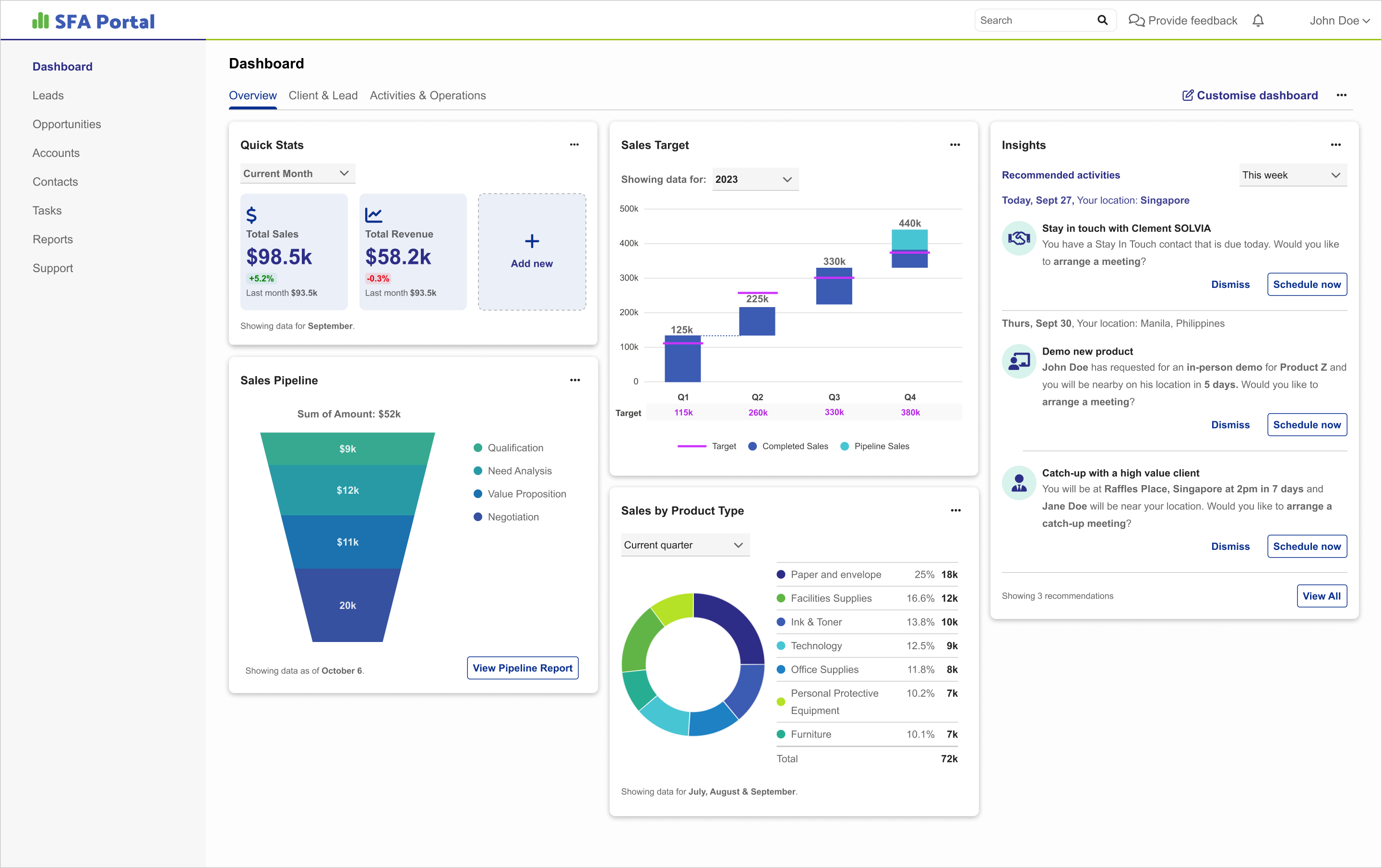
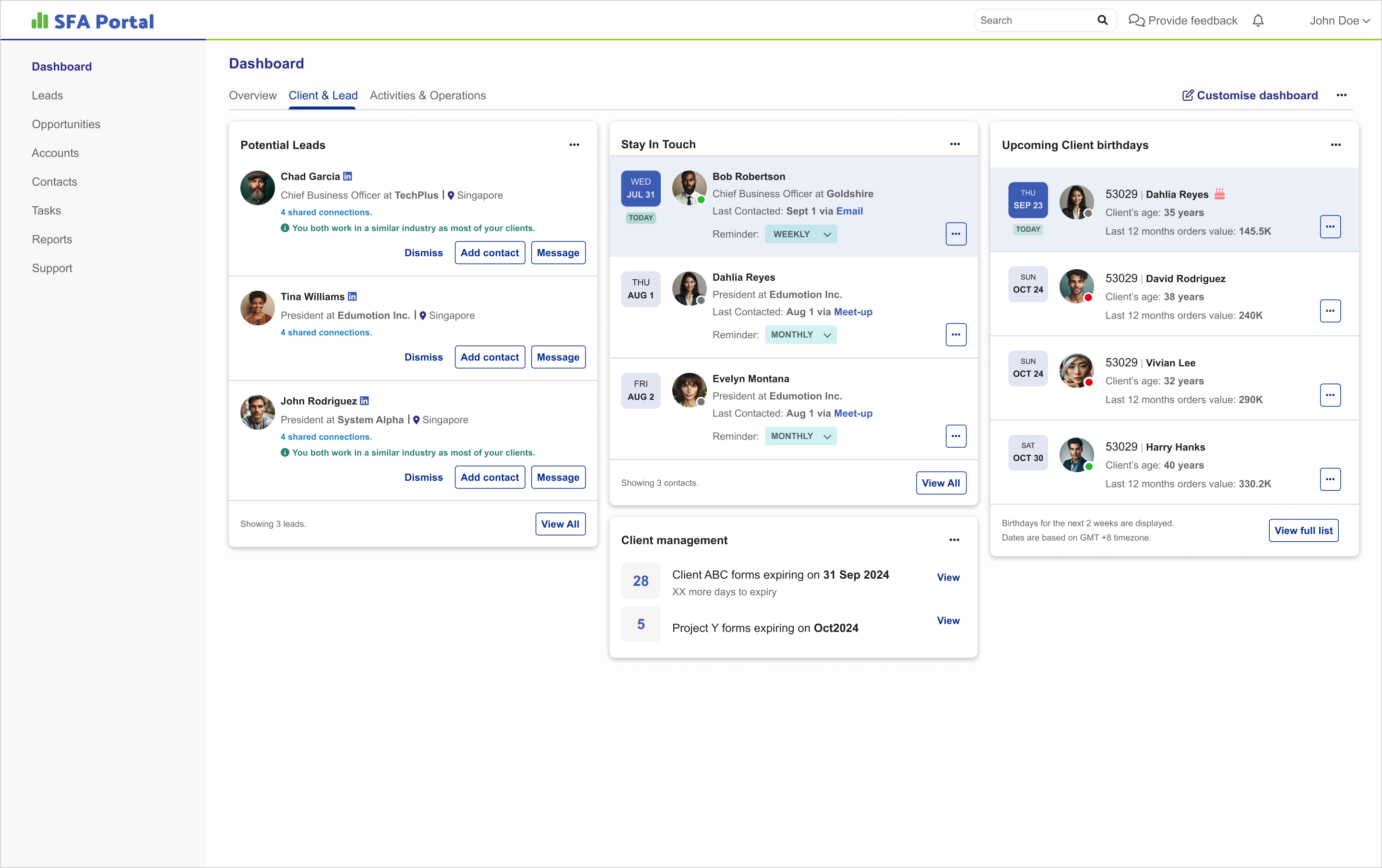
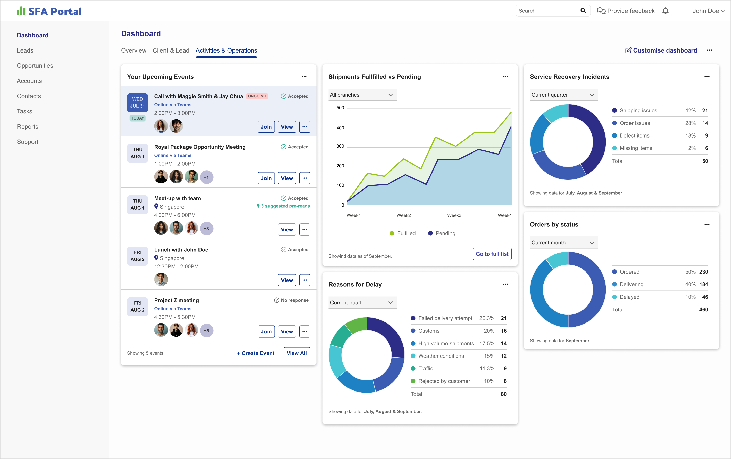
During the session, we chose to utilize the card component from our internal design system to present the dashboard widgets in a more organized and structured way. We categorized these widgets into three main groups, ensuring comprehensive coverage of the client’s key sales functions and effectively aligning the dashboard with their operational goals.
DASHBOARD WIDGETS
| CATEGORY | WIDGET | DESCRIPTION |
|---|---|---|
| Overview | Quick Stats | Snapshot of critical metrics |
| Sales Target | Displays current targets and progress | |
| Insights | Highlights key trends for strategic decisions | |
| Sales by Product Type | Breaks down sales performance by product categories | |
| Sales Pipeline | Visualizes stages and deal volumes | |
| Clients & Leads | Potential Leads | Lists potential leads and their statuses |
| Client Management | Manages existing client relationships | |
| Stay in Touch | Tracks communication history and follow-ups | |
| Upcoming Client Birthdays | Reminds users of upcoming client birthdays | |
| Activities & OPS | Upcoming Events | Tracks scheduled meetings and events |
| Shipment Status | Monitors order fulfillment | |
| Reasons for Delay | Explains delays in processes | |
| Order by Status | Categorizes orders by their current status | |
| Service Incidents | Logs and resolves service recovery issues |
Mockups
I immediately focused on creating high-fidelity screens in Figma, incorporating design components such as buttons, dropdowns and tabs from our internal design system. This approach not only expedited the wireframing process but also ensured a cohesive and consistent design across all UI elements. Following this, we held several design review sessions with the CEO to fine-tune and polish the designs.
Result
While we didn't secure the project due to the client choosing a more well-known agency, our project pitch successfully demonstrated our company’s ability to deliver efficient and visually appealing solutions. This presentation not only highlighted our strengths but also left a lasting impression on the client.
As a result, we successfully maintained the relationship and later secured a different project with the client, demonstrating the trust and confidence they had in our company's ability to meet their needs.


