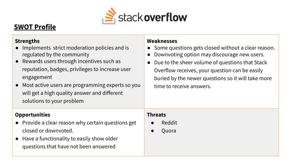
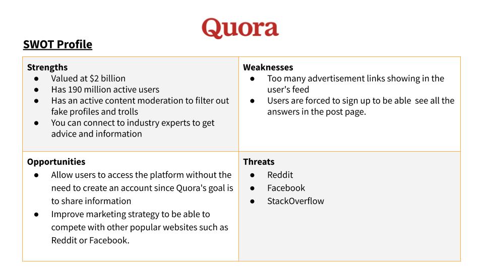
CodePal
An expert application for quick, accurate answers to your coding questions.
Overview
CodePal is an application for professional programmers to get help on their coding problems or answer their fellow programmers’ questions.
Purpose: A project for my UX Design course in CareerFoundry
Duration: 10 months (Part-time)
Role: UX/UI Designer
Methods: Design Thinking
Tools: Adobe XD, Balsamiq, Lucid Chart
How can we help programmers get fast and reliable answers to their coding questions?
Problem Statement
IT programmers use platforms to find solutions when they get stuck on a coding problem. However, sometimes the solution provided by the platform is not the appropriate answer to their specific situation. They need to get answers fast and it should be an effective and useful answer.
Solution
CodePal allows users to post a specific programming problem with an example or description of an issue, along with a price they are willing to pay for the solution. On a first-come-first-served basis, an expert can submit a solution. The solution is presented in a video chat to prove the behaviour is working. The problem becomes “locked” until the originator reviews and accepts or rejects the solution.
USER INTERVIEW & AFFINITY DIAGRAM
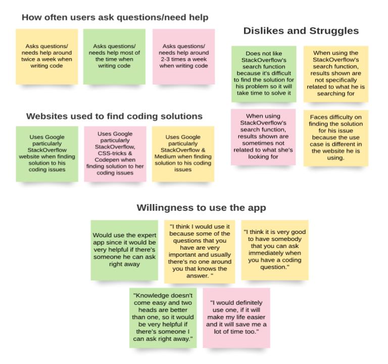
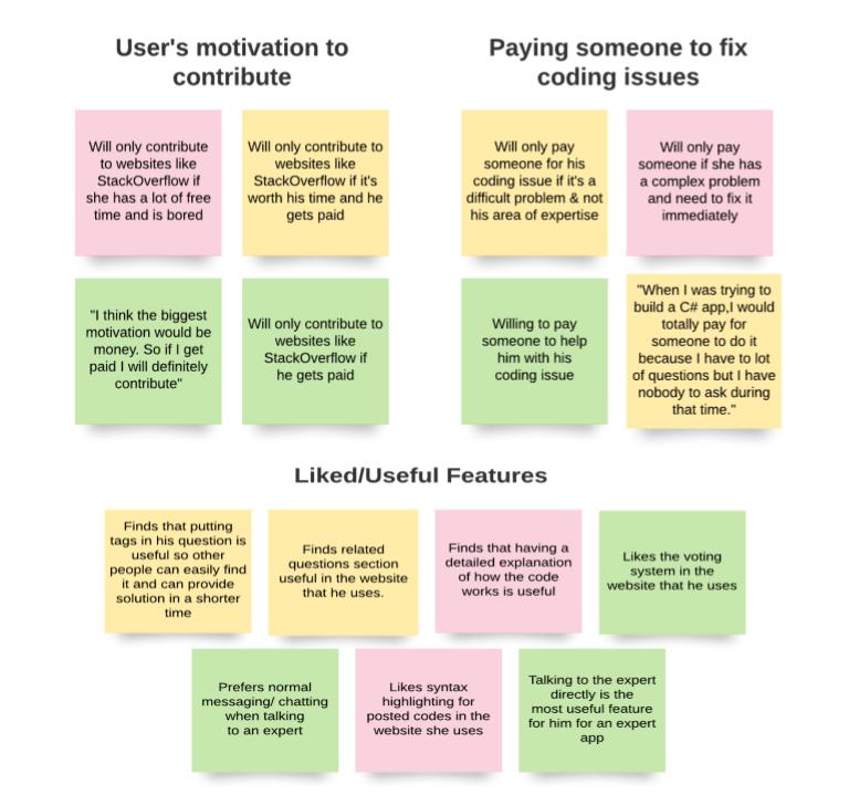
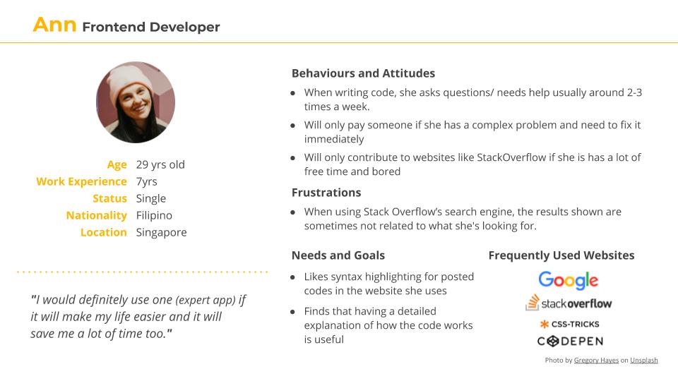
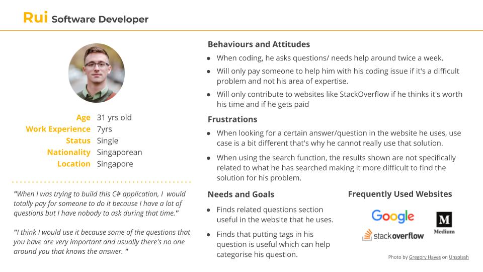
I interviewed three software developers who are from my target audience. By conducting the interviews, it helped me understand the users' behaviours, needs, and goals, as well as their frustrations.
I used an Affinity diagram to organize the information I've gathered from the interview.
Insights:
- Users would consider using the app as they find it helpful to have someone they can ask immediately for coding problems.
- Users are willing to pay for someone to help them with their coding issues, especially for a complex problem.
- Users face difficulties and take more time on finding the right solution for their problem.
- Money is a motivator for users to contribute to the app.
USER JOURNEY MAP & FLOWS
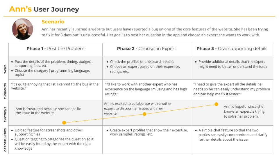
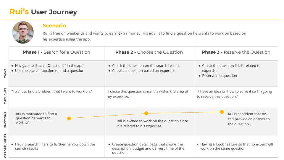
After I have defined my core personas, I created a user journey map to have a high-level view of how a user interacts with the application and it shows the different stages that the user goes through to complete a certain goal. This helps me to quickly identify areas of improvement.
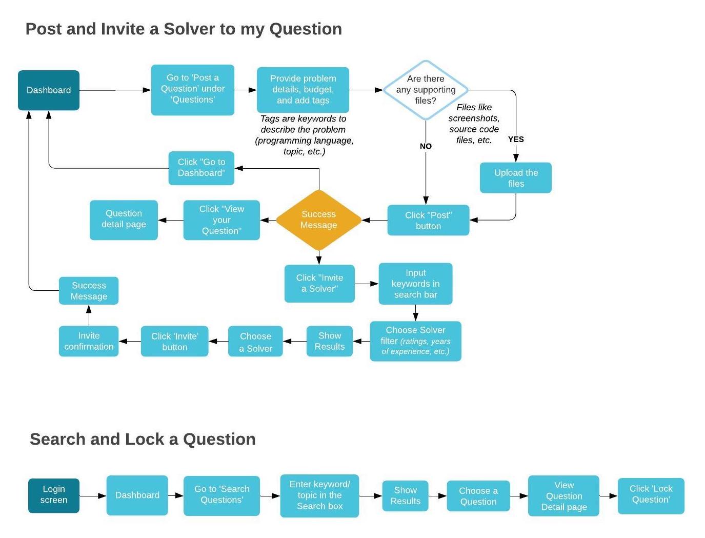
Then I created user flows to help me evaluate the efficiency of the process needed to achieve a user goal.
I have defined 2 primary user flows:
- Post and Invite a Solver to my Question
- Search and Lock a Question
Foundational Design
WIREFRAMES
I started my wireframing process with pen and paper sketches of the main features of the application ( post and invite a solver, search and lock a question). Then I transferred these sketches to Balsamiq to have cleaner and presentable wireframes. From Balsamiq, I created my high fidelity wireframes using Adobe XD and continue to add in some details to the wireframes.
The below images shows the development of the wireframes, from low to high fidelity.
Testing & Iteration
USABILITY TESTING
Using Adobe XD, I created my interactive prototype and conducted usability testing with 6 participants. I’ve sorted the results using affinity mapping and transferred the information to a Rainbow Spreadsheet which you can view here.
The following are some of the issues that were highlighted in the test results:
Issue #1: Users want to be able to see more features or do more things in the Guest account before signing up.
Suggested Change: Let the users explore the app more ( i.e let them fill up the post a question form) before asking to sign up.
Evidence: Two of the participants were a bit hesitant to sign up because they want to explore the Codepal features more in the guest account before signing up.
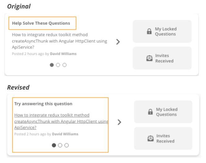
Issue #2: Clicked 'Help solve these questions' section instead of 'Search Question' in the navigation bar.
Suggested Change: Update ‘Help solve these questions to ‘Try answering this question’ and add an underline to the sample question to know that it’s clickable.
Evidence: When the participants were asked to find a question they want to answer, 5 out of 6 participants clicked the ‘Help solve these questions’ section first instead of the ‘Search Question’ link in the navbar.
Issue #3: The question mark icon beside the 'Lock this question' button is too small.
Suggested Change: Increase the size of the question mark icon so it will be more noticeable.
Evidence: One of the users commented that he did not notice the icon at all.
Visual Details
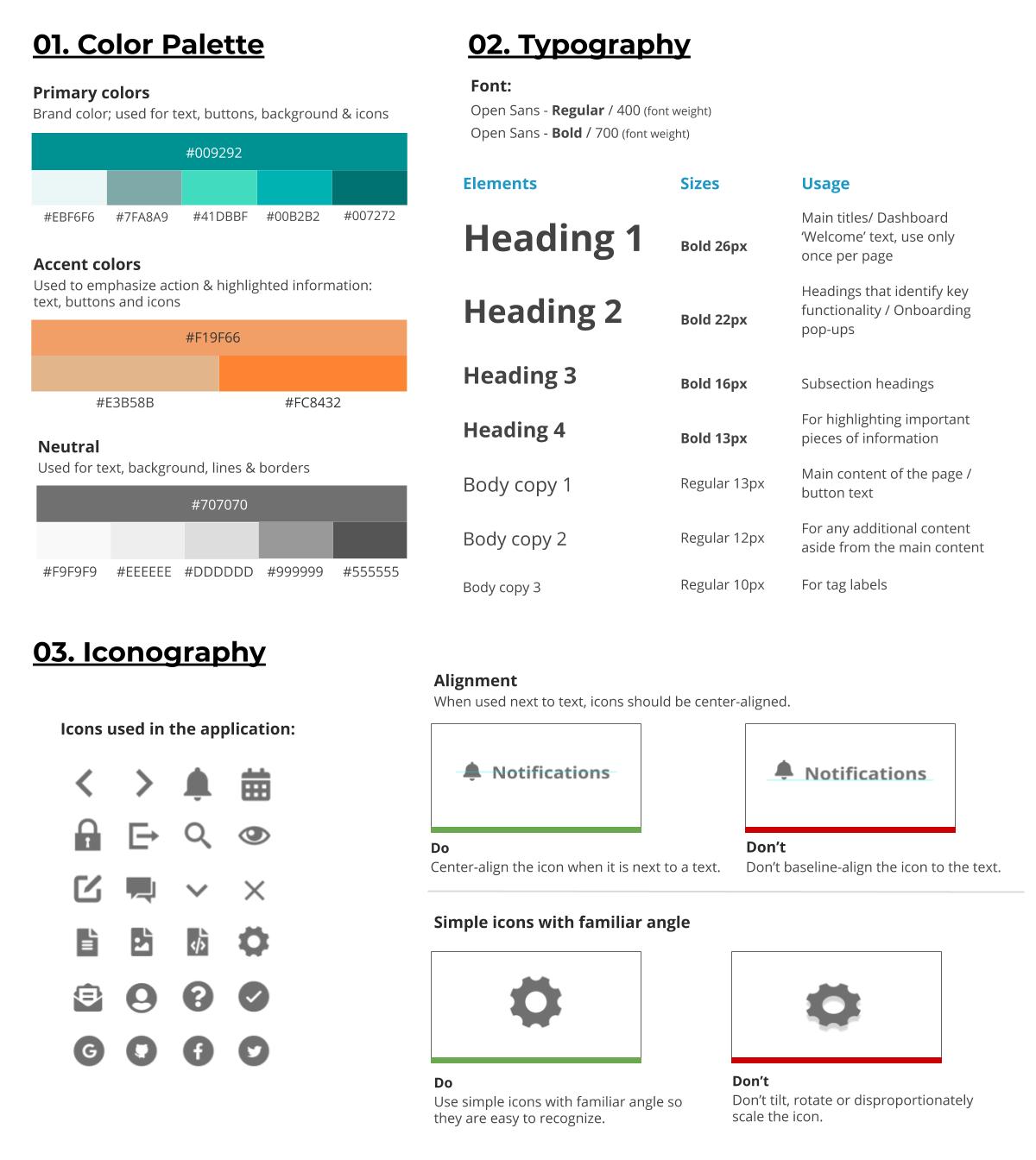
DESIGN SYSTEM
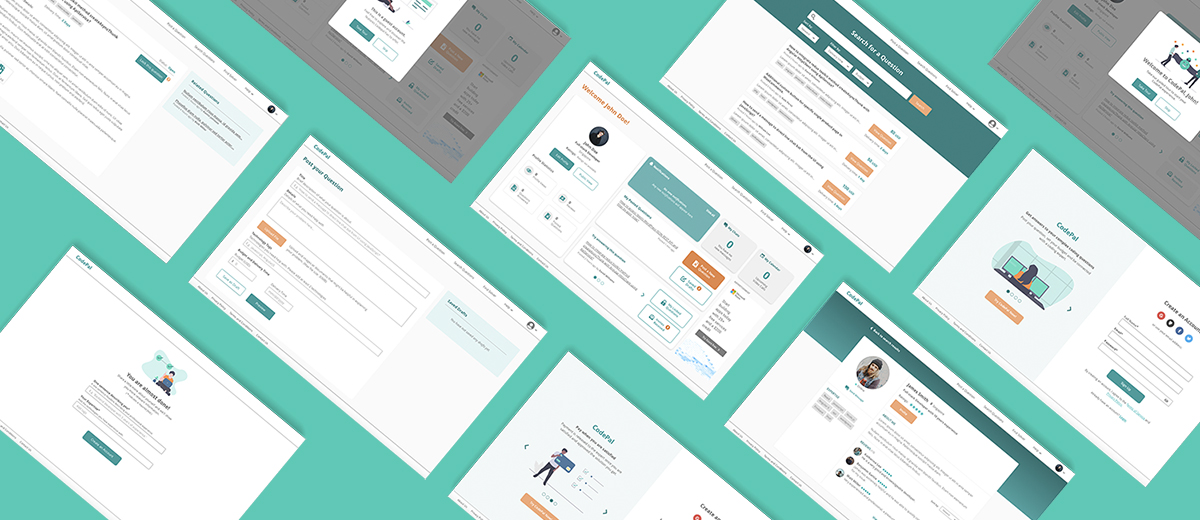
I created a design system to have a consistent visual design that will allow users to learn the application quickly and have a smooth experience.
Next Steps
- Another round of testing - Since my current prototype has not been tested again with my target audience, I want to conduct another round of user testing.
- Add more functionalities - My current prototype has limited functionalities. Thus, I would like to add more functionalities to the prototype such as video-sharing with the expert and approving/rejecting of answers to the users' questions.
Learnings
- Throughout the project, I realised it is important to keep on referring back to my initial problem statement because it helps me ensure that what I'm designing still aligns with my core problem statement.
- When doing wireframes, I should keep it simple and focus more on presenting the content that feels intuitive for the users and how the site navigation should work, details can be added later on.
- Designing with intention is important so our design could be functional and relevant to people and to be able to easily explain our reasoning behind every design decision we make.
