Perfect Properties
A responsive web app that simplifies the process of finding properties
Overview
Perfect Properties is a responsive web application for people who are looking to buy or rent a property. They can also be connected with property agents to make the process of finding a property as easy as possible.
Purpose: A project for my specialisation course - UI for UX Designers in CareerFoundry
Duration: 2 months (Full-time)
Role: UX/UI Designer
Methods: Design Thinking
Tools: Sketch, Invision, Adobe Photoshop, Principle
How can we help property seekers find the right property for them?
Problem Statement
Finding the perfect property is an exciting and emotional experience but it often gets complicated and time-consuming. Our user needs a tool that can be accessible anywhere and provides reliable and easy to read information about the property they are looking for.
Goal
Create a responsive web application that property seekers can access in any situation to provide a seamless and engaging experience.
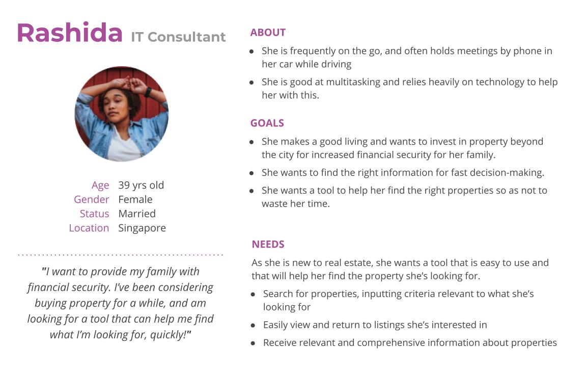
User Persona
My main persona is Rashida and I used her persona to focus on the goals and needs of my target audience.
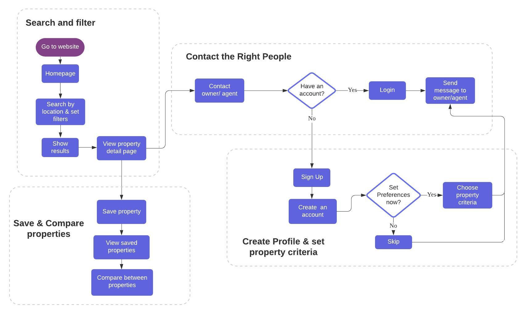
User Flows
Based on my persona, I created a high-level user flow that helped me determine how all the journeys tie to each other and how many screens are needed.
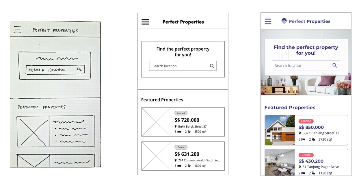
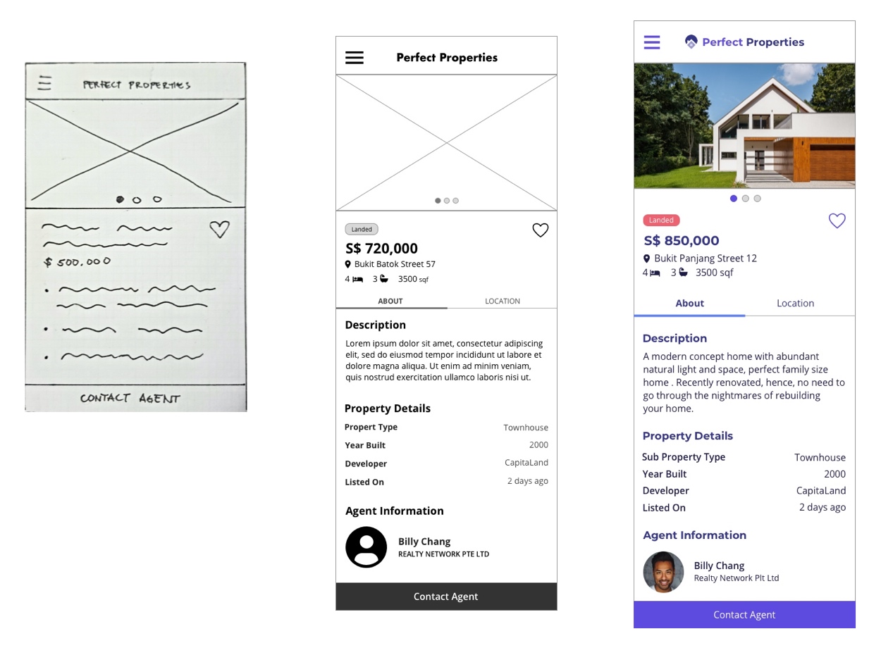
Wireframes
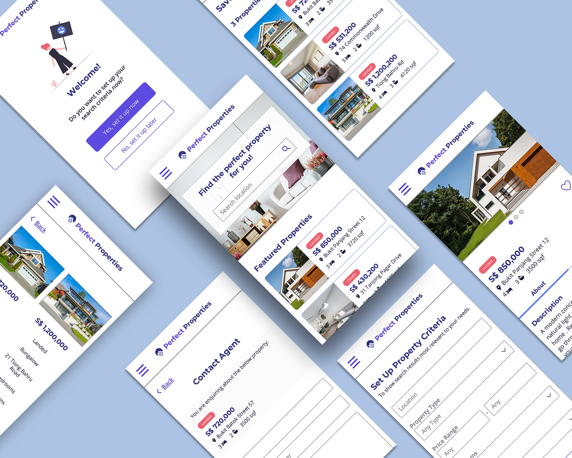
After creating the user flow, I used pen and paper to sketch my low-fidelity wireframes that allow me to quickly visualise and test various ideas. I converted these sketches to a digital format using Sketch. During this process, my focus is creating the UI elements needed for each screen, establishing a clear visual hierarchy, and applying UI design patterns.
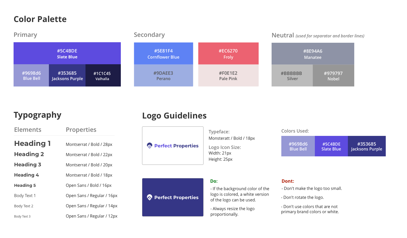
Having determined the color scheme, imagery, typography, and iconography, I started the process towards my high-fidelity wireframes.
The following images show the development of some of my wireframes, from low to high fidelity.
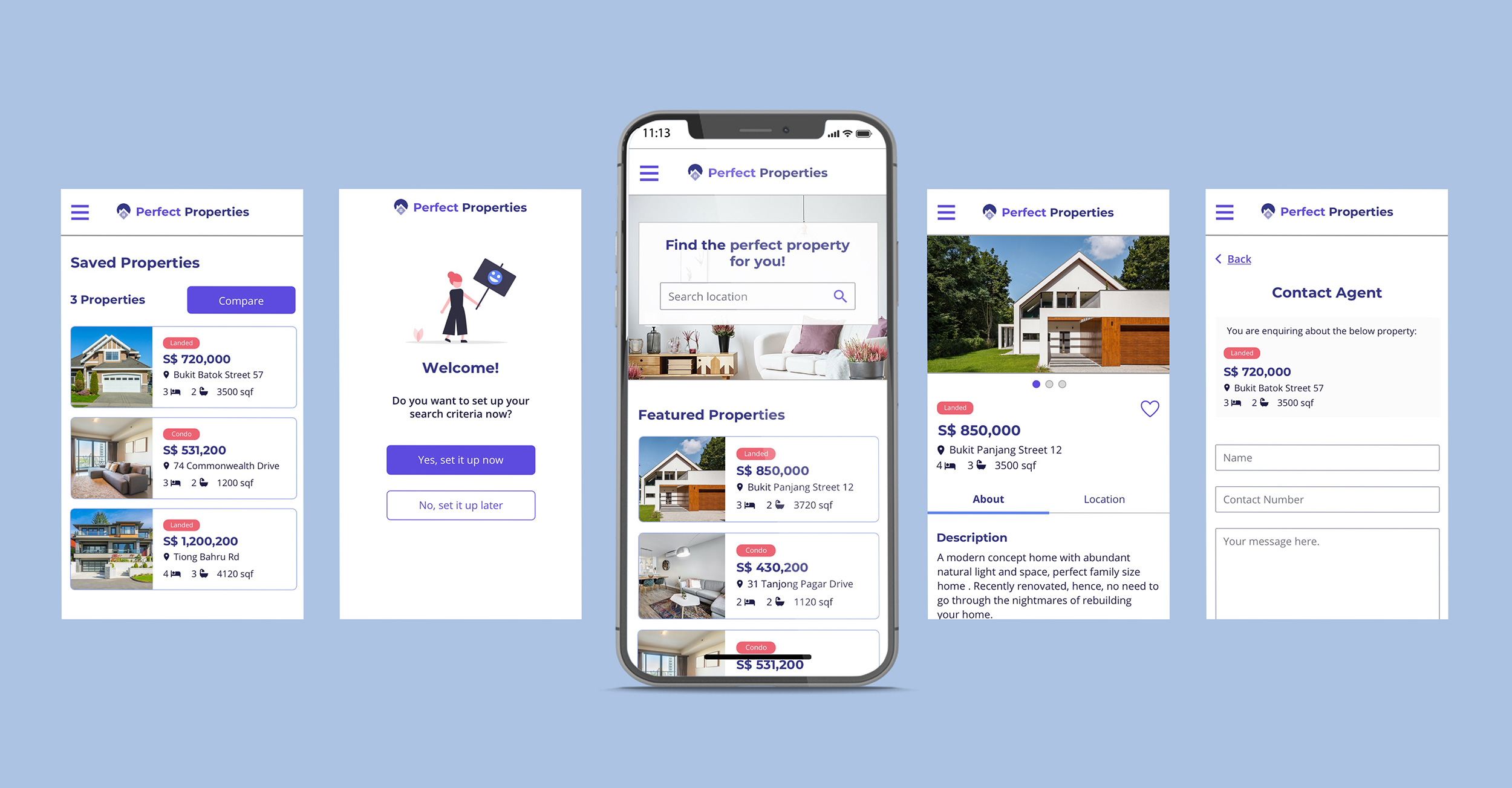
Homepage
For the property card, I initially placed the property type pill beside the location name. However, I realised there will not be enough space if the location name is too long. So I decided to put the pill on top of the property price to have enough space for a longer location name.
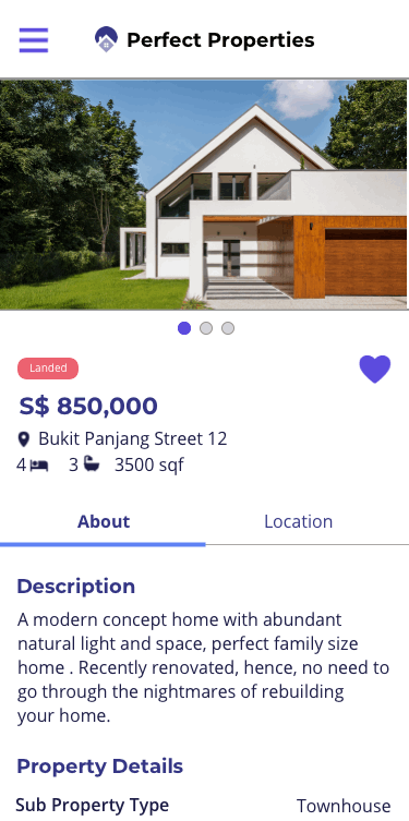
Property Detail Page
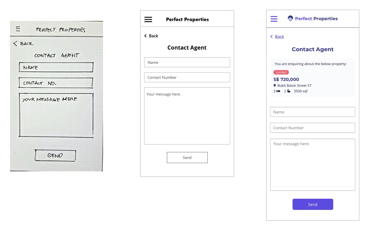
Contact Agent Page
When I was working on my mid-fidelity wireframe, I got user feedback on how can she check which property is she enquiring about. So I added the property info section on the page so users don't need to go back to the previous page just to check which property are they asking about.
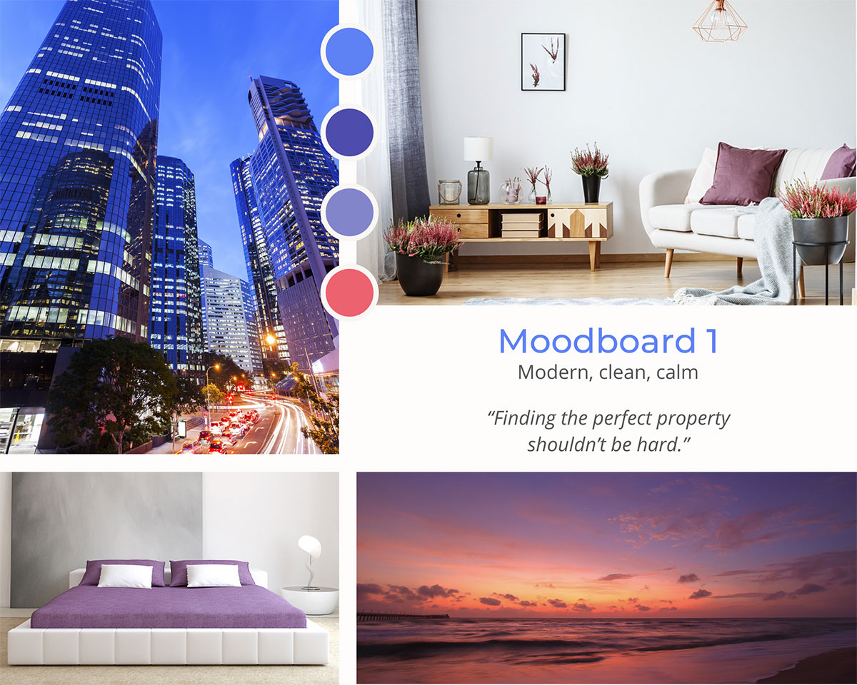
Mood Board
Searching for a property can be a stressful and frustrating process so having a design that invokes a calm and soothing feeling is preferred. To cater to our persona's busy lifestyle, I want to use a design that is minimalist and clean so that our users can easily use the web app and focus on its functionality with fewer distractions.
I chose different shades of purple and added a shade of blue to add a more calming look to the design and a shade of pink for a friendly and positive feel.
Animation
It is my first attempt at creating animated user interfaces. I used Principle to implement this simple image sliding animation.
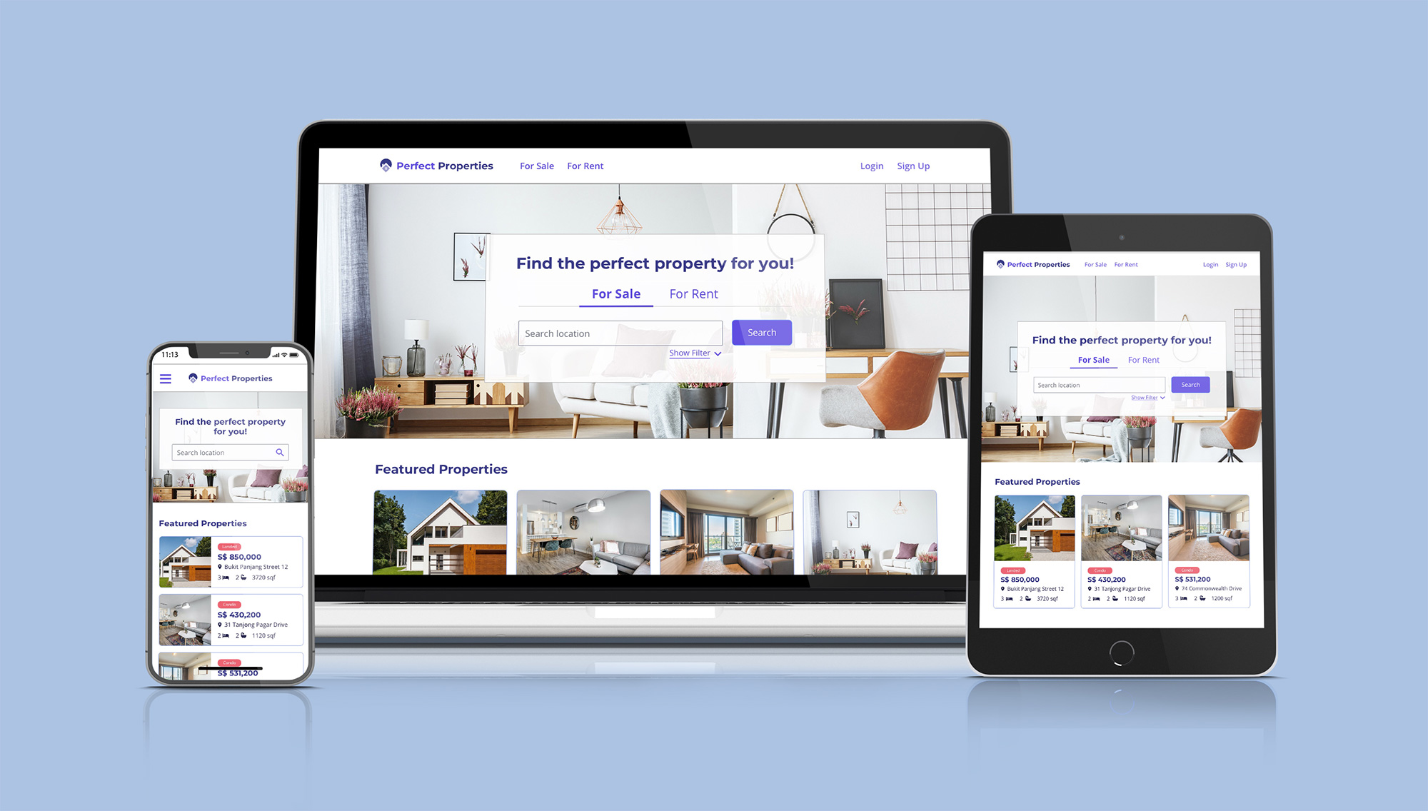
Responsive Design
I've used a mobile-first approach in designing Perfect Properties. So after designing for the smallest screen, I worked my way up on designing sample screens for the tablet and desktop.
Below is the design for the Homepage. For the mobile design, I decided to hide the For Sale/Rent and Filter options because of the limited space. Instead, I put these options into a modal that will be displayed when the search bar is clicked.
As for the desktop/tablet viewport, I initially designed the 'For Sale' and 'For Rent' options as buttons with purple background color but I got user feedback that it looks too strong. So I converted it to a tab-style design for a cleaner look.
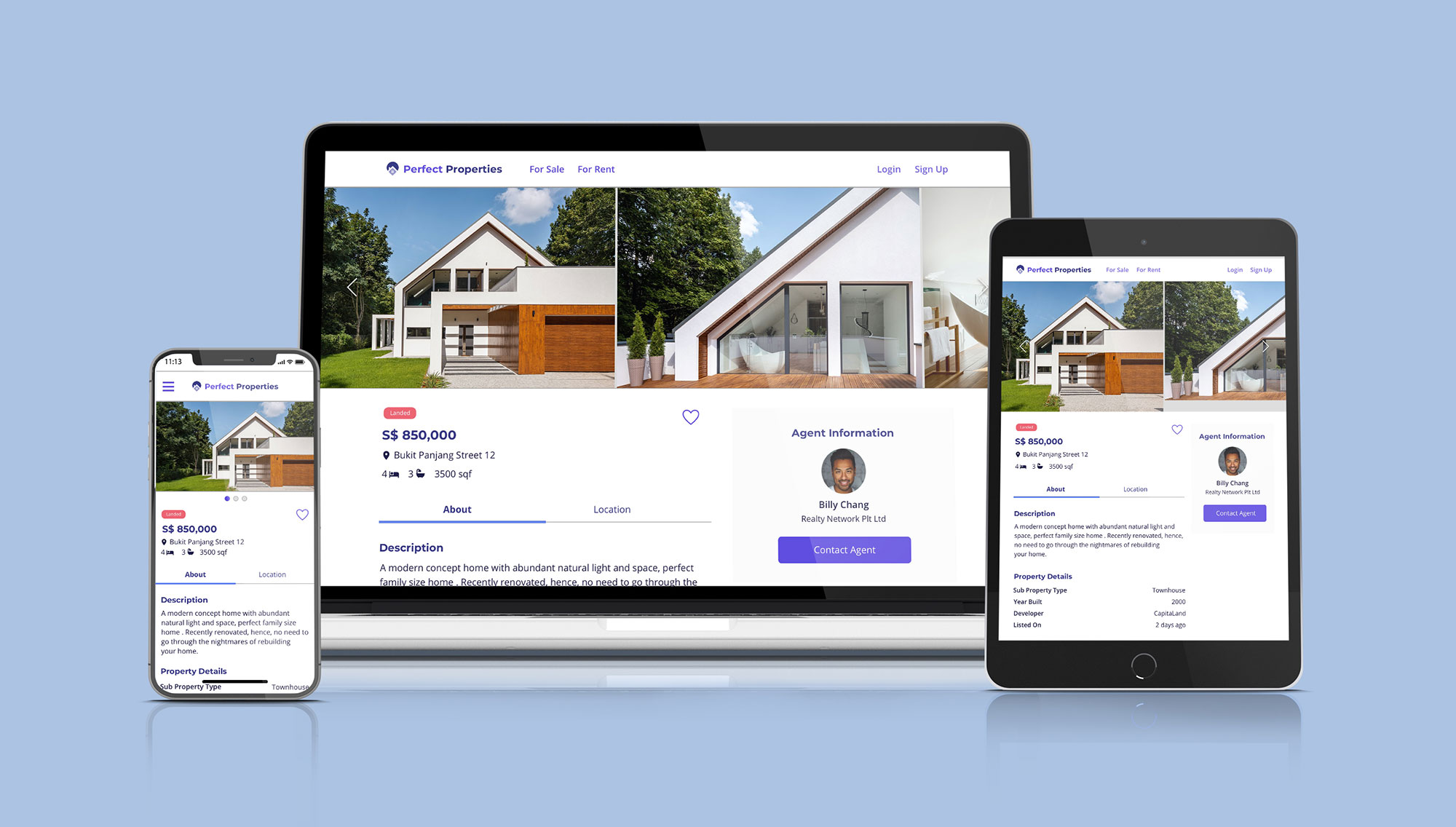
Here is the Property Detail page. This page has an image slider and the mobile design uses a 1 column layout that shows the property details and agent information.
For the desktop/tablet viewport, I used a 2-column layout to show the property details in the first column and the agent information in the second column.
Learnings
- Taking accessibility design into consideration - It’s important that we don’t neglect those who have different needs and this means designing in a way that’s accessible by everyone.
- Get opinions from peers - As I didn't have enough time to conduct multiple rounds of user testing, I realised how important it is to get feedback from peers especially when working alone on a project since there are things we may have missed and also to get valuable feedback from a fresh pair of eyes.
- Use of UI Design Patterns - Instead of reinventing the wheel for every new interface, using an already established UI design pattern can save us time and also facilitate faster prototyping and user familiarity.